


This is a summary of chapter 2 of the Introduction to Statistical Learning textbook. I’ve written a 10-part guide that covers the entire book. The guide can be read at my website, or here at Hashnode. Subscribe to stay up to date on my latest Data Science & Engineering guides!
What is Statistical Learning?
Assume that we have an advertising dataset that consists of TV advertising spend, radio advertising spend, newspaper advertising spend, and product sales.
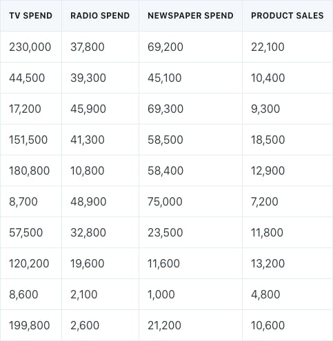
We could build a multiple linear regression model to predict sales by using the different types of advertising spend as predictors.
- Product sales would be the response variable (Y)
The different advertising spends would be the predictors (X₁, X₂, X₃)
The model could be written in the following general form:
Y = f(X) + e
The symbol f represents the systematic information that X provides about Y. Statistical learning refers to a set of approaches for estimating f.
Reasons for Estimating f
There are two main reasons for estimating f: prediction and inference.
Prediction
Prediction refers to any scenario in which we want to come up with an estimate for the response variable Y.
Inference
Inference involves understanding the relationship between X and Y, as opposed to predicting Y. For example, we may ask the following questions:
- Which predictors X are associated with the response variable Y?
- What is the relationship between the predictor and response?
- What type of model best explains the relationship?
Methods of Estimating f
There are two main methods of estimating f: parametric and nonparametric.
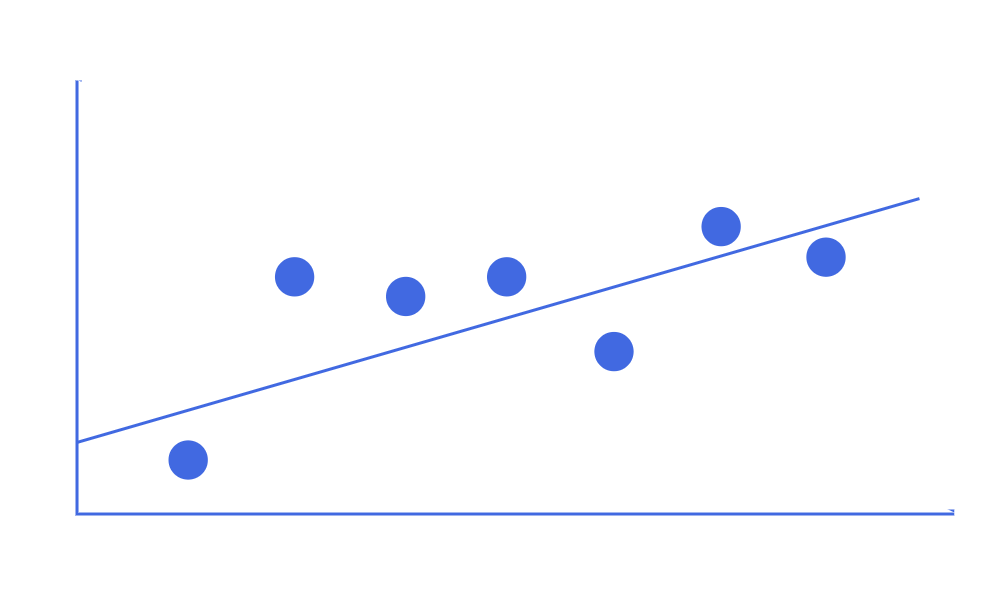
Parametric
Parametric methods involve the following two-step model-based approach:
- Make an assumption about the function form (linear, lognormal, etc.) of f
- After selecting a model, use training data to fit or train the model
Nonparametric
On the other hand, nonparametric methods do not make explicit assumptions about the functional form of f.
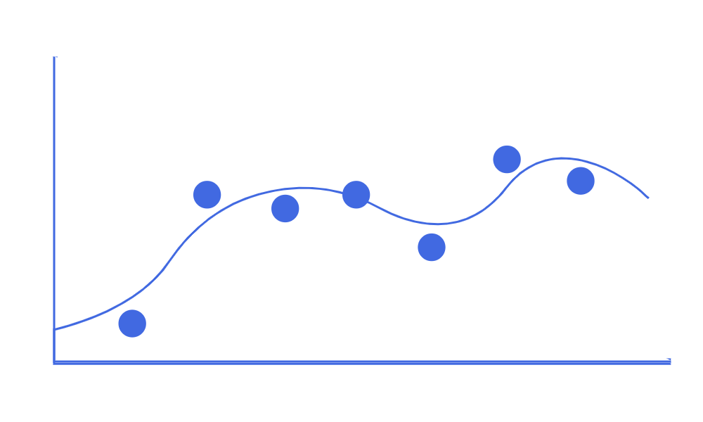
Instead, they attempt to get as close to the data points as possible, without being too rough or too smooth. They have the potential to accurately fit a wider range of possible shapes for f. Spline models are common examples of nonparametric methods.
Parametric vs Nonparametric
Nonparametric methods have the potential to be more accurate due to being able to fit a wider range of shapes. However, they are more likely to suffer from the issue of overfitting to the data.
Additionally, parametric methods are much more interpretable than nonparametric methods. For example, it is much easier to explain the results of a linear regression model than it is to explain the results of a spline model.
Assessing Model Accuracy
In statistical learning, we’re not only interested in the type of model to fit to our data, but also how well the model fits the data.
One way to determine how well a model fits is by comparing the predictions to the actual observed data.
Regression Accuracy
In regression, the most commonly used method to assess model accuracy is the mean squared error (MSE):
- n — represents the number of observations in the data
- y — represents the actual response value in the data
- y-hat — represents the predicted response value

Bias-Variance Tradeoff
However, we should usually be interested in the error of the test dataset instead of the training dataset. This is because we usually want the model that best predicts the future, and not the past. Additionally, more flexible models will reduce training error, but may not necessarily reduce test error. Therefore, the test error should be of higher concern.
In general, to minimize the expected test error, a model that has low variance and low bias should be chosen.
Bias refers to the error that is introduced by modeling a very complicated problem with a simplistic model. More flexible models have less bias because they are more complex.
Variance refers to how good a model is if it was used on a different training dataset. More flexible models have higher variance.
The relationship among bias, variance, and the test error is known as the bias-variance tradeoff. The challenge lies in finding the method in which both bias and variance are low.
Classification Accuracy
In classification, the most commonly used method to assess model accuracy is the error rate (the proportion of mistakes made):

However, again, we should usually be interested in the error rate of the test dataset instead of the training dataset.
The test error rate can be minimized through a very simple classifier known as the Bayes’ classifier. The Bayes’ classifier assigns classes based on a known predictor value.
For example, assume that we knew for a fact that 70% of all people who make more than $100,000 per year were STEM graduates.
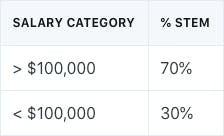
The Bayes’ classifier predicts one class if the probability of a certain class is greater than 50%. Otherwise, it predicts the other class. The Bayes’ decision boundary is the line at which the probability is exactly 50%. The classifier predictions are based on this boundary.
For example, if we were given a test dataset of just salary values, we’d simply assign any salaries greater than $100,000 as STEM graduates, and salary values less than $100,000 as non-STEM graduates.
The Bayes’ classifier produces the lowest possible test error rate, called the Bayes’ error rate.
In theory, we would always like to predict classifications using the Bayes’ classifier. However, we do not always know the probability of a class, given some predictor value. We have to estimate this probability, and then classify the data based on the estimated probability.
K-Nearest Neighbors (KNN)
The K-Nearest Neighbors (KNN) classifier is a popular method of estimating conditional probability. Given a positive integer K and some test observation, the KNN classifier identifies the K points in the training data that are closest to the test observation. These closest K points are represented by N₀. Then, it estimates the conditional probability for a class as the fraction of points in N₀ that represent that specific class. Lastly, KNN will apply the Bayes’ rule and classify the test observation to the class with the largest probability.
However, the choice of the K value is very important. Lower values are more flexible, whereas higher values are less flexible but have more bias. Similar to the regression setting, a bias-variance tradeoff exists.
Originally published at https://www.bijenpatel.com/ on August 2, 2020.
I will be releasing the equivalent Python code for these examples soon. Subscribe to get notified!
ISLR Chapter 2 — R Code
Basic R Functions
# Assign a vector to a new object named "data_vector"
data_vector = c(1, 2, 3, 4)

# List of all objects
ls()

# Remove an object
rm(data_vector)

# Create two vectors of 50 random numbers
# with mean of 0 and standard deviation of 1
random_1 = rnorm(50, mean=0, sd=1)
random_2 = rnorm(50, mean=0, sd=1)

# Create a dataframe from the vectors
# with columns labeled as X and Y
data_frame = data.frame(X=random_1, Y=random_2)

# Get the dimensions (rows, columns) of a dataframe
dim(data_frame)
## 50 2

# Get the class types of columns in a dataframe
sapply(data_frame, class)
##         X         Y
## "numeric" "numeric"

# Easily omit any NA values from a dataframe
data_frame = na.omit(data_frame)

# See the first 5 rows of the dataframe
head(data_frame, 5)
##            X          Y
## 1  1.3402318 -0.2318012
## 2 -1.8688186  1.0121503
## 3  2.9939211 -1.7843108
## 4 -0.9833264 -1.0518947
## 5 -1.2800747 -0.4674771

# Get a specific column (column X) from the dataframe
data_frame$X
## 1.3402318 -1.8688186 2.9939211 -0.9833264 -1.2800747

# Get the mean, variance, or standard deviation
mean(random_1)
## -0.1205189

var(random_1)
## 1.096008

sd(random_1)
## 1.046904</span>
Plotting with ggplot
# Create a scatter plot using the ggplot2 package
plot_1 = ggplot(data_frame, aes(x=data_frame$X, y=data_frame$Y)) +
  geom_point() +
  coord_cartesian(xlim=c(-3, 3), ylim=c(-3, 3)) +
  labs(title="Random X and Random Y", subtitle="Random Numbers", y="Y Random", x="X Random") +
  scale_x_continuous(breaks=seq(-3, 3, 0.5)) +
  scale_y_continuous(breaks=seq(-3, 3, 0.5)) +
  geom_point(colour="blue") +
  geom_point(aes(col=data_frame$X))

# Visualize the ggplot
plot(plot_1)</span>