ISLR Chapter 10 — Unsupervised Learning

My name is Bijen Patel. I'm currently a Data Scientist. I'm also a former Actuary. I’m interested in all things related to data, statistics, tech, and startups. I enjoy writing and teaching others.
This is a summary of chapter 10 of the Introduction to Statistical Learning textbook. I’ve written a 10-part guide that covers the entire book. The guide can be read at my website, or here at Hashnode. Subscribe to stay up to date on my latest Data Science & Engineering guides!
The statistical methods from the previous chapters focused on supervised learning. Again, supervised learning is where we have access to a set of predictors X, and a response Y. The goal is to predict Y by using the predictors.
In unsupervised learning, we have a set of features X, but no response. The goal is not to predict anything. Instead, the goal is to learn information about the features, such as discovering subgroups or relationships.
In this chapter, we will cover two common methods of unsupervised learning: principal components analysis (PCA) and clustering. PCA is useful for data visualization and data pre-processing before using supervised learning methods. Clustering methods are useful for discovering unknown subgroups or relationships within a dataset.
The Challenge of Unsupervised Learning
Unsupervised learning is more challenging than supervised learning because it is more subjective. There is no simple goal for the analysis. Also, it is hard to assess results because there is no “true” answer. Supervised learning is usually performed as part of the data exploratory process.
Principal Components Analysis
Principal components analysis was previously covered as part of principal components regression from chapter six. Therefore, this section will be nearly identical to the explanation from chapter six, but without the regression aspects.
When we have a dataset with a large number of predictors, dimension reduction methods can be used to summarize the dataset with a smaller number of representative predictors (dimensions) that collectively explain most of the variability in the data. Each of the dimensions is some linear combination of all of the predictors. For example, if we had a dataset of 5 predictors, the first dimension (Z₁) would be as follows:

Note that we will always have less dimensions than the number of predictors.
The ϕ values for the dimensions are known as loading values. The values are subject to the constraint that the square of the ϕ values in a dimension must equal one. For our above example, this means that:

The ϕ values in a dimension make up a “loading vector” that defines a “direction” to explain the predictors. But how exactly do we come up with the ϕ values? They are determined through principal components analysis.
Principal components analysis is the most popular dimension reduction method. The method involves determining different principal component directions of the data.
The first principal component direction (Z₁) defines the direction along which the data varies the most. In other words, it is a linear combination of all of the predictors, such that it explains most of the variance in the predictors.
The second principal component direction (Z₂) defines another direction along which the data varies the most, but is subject to the constraint that it must be uncorrelated with the first principal component, Z₁.
The third principal component direction (Z₃) defines another direction along which the data varies the most, but is subject to the constraint that it must be uncorrelated with both of the previous principal components, Z₁ and Z₂.
And so on and so forth for additional principal component directions.
Dimension reduction is best explained with an example. Assume that we have a dataset of different baseball players, which consists of their statistics in 1986, their years in the league, and their salaries in the following year (1987).
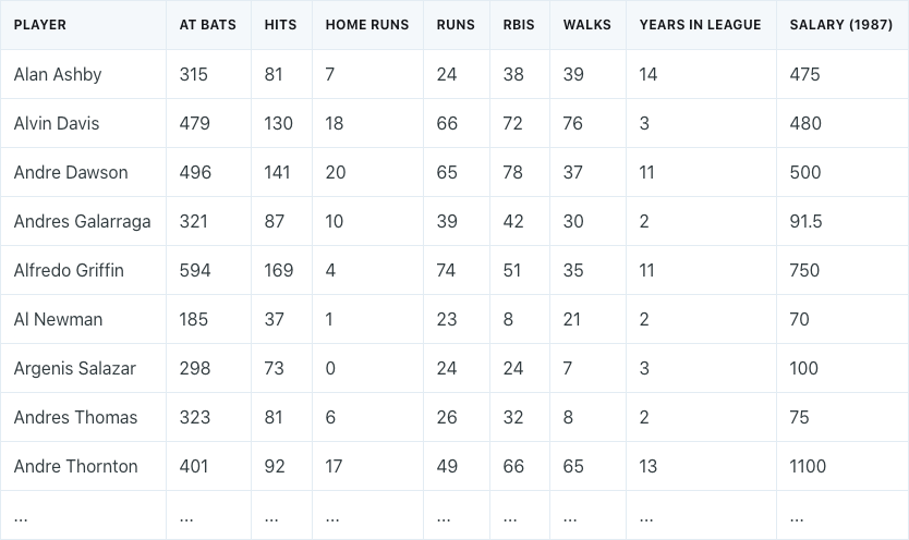
We need to perform dimension reduction by transforming our 7 different predictors into a smaller number of principal components to use for regression.
It is important to note that prior to performing principal components analysis, each predictor should be standardized to ensure that all of the predictors are on the same scale. The absence of standardization will cause the predictors with high variance to play a larger role in the final principal components obtained.
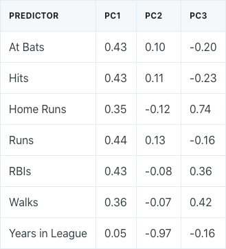
Performing principal components analysis would result in the following ϕ values for the first three principal components:
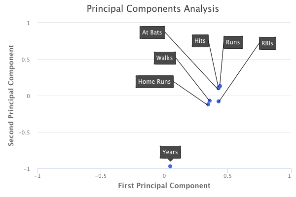
A plot of the loading values of the first two principal components would look as follows:
How do we interpret these principal components?
If we take a look at the first principal component, we can see that there is approximately an equal weight placed on each of the six baseball statistic predictors, and much less weight placed on the years that a player has been in the league. This means that the first principal component roughly corresponds to a player’s level of production.
On the other hand, in the second principal component, we can see that there is a large weight placed on the number of years that a player has been in the league, and much less weight placed on the baseball statistics. This means that the second principal component roughly corresponds to how long a player has been in the league.
In the third principal component, we can see that there is more weight placed on three specific baseball statistics: home runs, RBIs, and walks. This means that the third principal component roughly corresponds to a player’s batting ability.
Performing principal components analysis also tells us the percent of variation in the data that is explained by each of the components. The first principal component from the baseball data explains 67% of the variation in the predictors. The second principal component explains 15%. The third principal component explains 9%. Therefore, together, these three principal components explain 91% of the variation in the data.
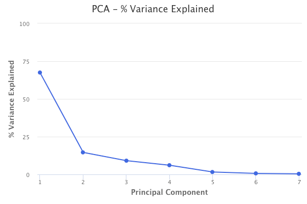
This helps explain the key idea of principal components analysis, which is that a small number of principal components are sufficient to explain most of the variability in the data. Through principal components analysis, we’ve reduced the dimensions of our dataset from seven to three.
The number of principal components to use can be chosen by using the number of components that explain a large amount of the variation in the data. For example, in the baseball data, the first three principal components explain 91% of variation in the data, so using just the first three is a valid option. Aside from that, there is no objective way to decide, unless PCA is being used in the context of a supervised learning method, such as principal components regression. In that case, we can perform cross-validation to choose the number of components that results in the lowest test error.
Principal components analysis can ultimately be used in regression, classification, and clustering methods.
Clustering Methods
Clustering refers to a broad set of techniques of finding subgroups in a dataset. The two most common clustering methods are:
- K-means Clustering
- Hierarchical Clustering
In K-means clustering, we are looking to partition our dataset into a pre-specified number of clusters.
In hierarchical clustering, we don’t know in advance how many clusters we want. Instead, we end up with a tree-like visual representation of the observations, called a dendogram, which allows us to see at once the clusterings obtained for each possible number of clusters from 1 to n.
K-Means Clustering
K-means clustering involves specifying a desired number of clusters K and assigning each observation to one of the clusters. The clusters are determined such that the total within-cluster variation, summed over all K clusters, is minimized. Within-cluster variation is defined as the squared Euclidean distance. The general process of performing K-means clustering is as follows:
- Randomly assign each observation to one of the clusters. These will serve as the initial cluster assignments.
- For each of the clusters, compute the cluster centroid. The cluster centroid is the mean of the observations assigned to the cluster.
- Reassign each observation to the cluster whose centroid is the closest.
- Continue repeating steps 2 & 3 until the result no longer changes.
A visual of the process looks something like the following graphic:
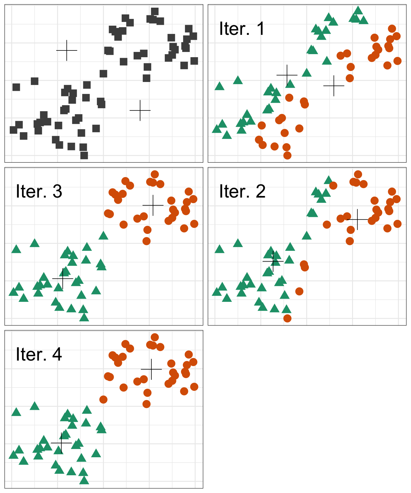
However, there is an issue with K-means clustering in that the final results depend on the initial random cluster assignment. Therefore, the algorithm should be run multiple times and the result that minimizes the total within-cluster variation should be chosen.
Hierarchical Clustering
Hierarchical clustering does not require choosing the number of clusters in advance. Additionally, it results in a tree-based representation of the observations, known as a dendogram.
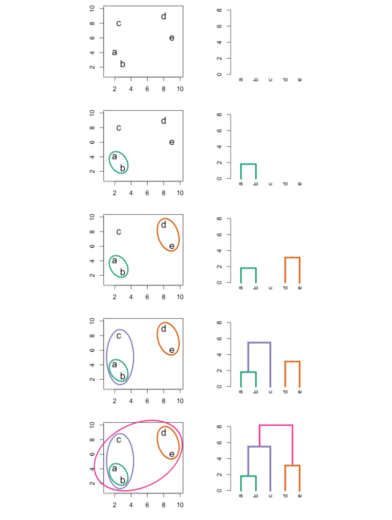
The most common type of hierarchical clustering is bottom-up (agglomerative) clustering. The bottom-up phrase refers to the fact that a dendogram is built starting from the leaves and combining clusters up to the trunk.
The following graphic is an example of hierarchical clustering in action:
Interpreting a Dendogram
At the bottom of a dendogram, each leaf represents one of the observations in the data. As we move up the tree, some leaves begin to fuse into branches. These observations that fuse are observations that are quite similar to each other. As we move higher up the tree, branches fuse with leaves or with other branches. Additionally, the earlier that fusions occur, the more similar the groups of observations are to each other.
When interpreting a dendogram, be careful not to draw any conclusions about the similarity of observations based on their proximity along the horizontal axis. In other words, if two observations are next to each other on a dendogram, it doesn’t mean that they are similar.
Instead, we draw conclusions about the similarity of two observations based on their location on the vertical axis where branches containing both of those observations are first fused.
In hierarchical clustering, the final clusters are identified by making a horizontal cut across the dendogram. The set of observations below the cut are clusters. The attractive aspect of hierarchical clustering is that a single dendogram can be used to obtain multiple different clustering options. However, the choice of where to make the cut is often not clear. In practice, people usually look at the dendogram and select a sensible number of clusters, based on the heights of the fusion and the number of clusters desired.
The term “hierarchical” refers to the fact that clusters obtained by cutting a dendogram at some height are nested within clusters that are obtained by cutting the dendogram at a greater height. Therefore, the assumption of a hierarchical structure might be unrealistic for some datasets, in which case K-means clustering would be better. An example of this would be if we had a dataset consisting of males and females from America, Japan, and France. The best division into two groups would be by gender. The best division into three groups would be by nationality. However, we cannot split one of the two gender clusters and end up with three nationality clusters. In other words, the true clusters are not nested.
Hierarchical Clustering Algorithm
The hierarchical clustering dendogram is obtained through the following process:
- First, we define some dissimilarity measure for each pair of observations in the dataset and initially treat each observation as its own cluster.
- The two clusters most similar to each other are fused.
- The algorithm proceeds iteratively until all observations belong to one cluster and the dendogram is complete. However, the concept of dissimilarity is extended to be able to define dissimilarity between two clusters if one or both have multiple observations. This is known as linkage, of which there are four types.
See the hierarchical clustering graphic above for an example of this process.
Complete linkage involves computing all pairwise dissimilarities between the observations in cluster A and cluster B, and recording the largest of the dissimilarities. Complete linkage is commonly used in practice.
Single linkage is the opposite of complete linkage, where we record the smallest dissimilarity instead of the largest. Single linkage can result in extended, trailing clusters where single observations are fused one-at-a-time.
Average linkage involves computing all pairwise dissimilarities between the observations in cluster A and cluster B, and recording the average of the dissimilarities. Average linkage is commonly used in practice.
Centroid linkage involves determining the dissimilarity between the centroid for cluster A and the centroid for cluster B. Centroid linkage is often used in genomics. However, it suffers from the drawback of potential inversion, where two clusters are fused at a height below either of the individual clusters in the dendogram.
Choice of Initial Dissimilarity Measure
As mentioned previously, the first step of the hierarchical clustering algorithm involves defining some initial pairwise dissimilarity measure for each pair of individual observations in the dataset. There are two options for this:
- Euclidean distance
- Correlation-based distance
The Euclidean distance is simply the straight-line distance between two observations.
Correlation-based distance considers two observations to be similar if their features are highly correlated, even if the observations are far apart in terms of Euclidean distance. In other words, correlation-based distance focuses on the shapes of observation profiles instead of their magnitude.
The choice of the pairwise dissimilarity measure has a strong effect on the final dendogram obtained. Therefore, the type of data being clustered and the problem trying to be solved should determine the measure to use. For example, assume that we have data on shoppers and the number of times each shopper has bought a specific item. The goal is to cluster shoppers together to ultimately show different advertisements to different clusters.
- If we use Euclidean distance, shoppers who have bought very few items overall will be clustered together.
- On the other hand, correlation-based distance would group together shoppers with similar preferences, regardless of shopping volume.
Correlation-based distance would be the preferred choice for the problem that is trying to be solved.
Regardless of which dissimilarity measure is used, it is usually good practice to scale all variables to have a standard deviation of one. This ensures that each variable is given equal importance in the hierarchical clustering that is performed. However, there are cases where this is sometimes not desired.
Practical Issues in Clustering
Decisions with Big Consequences
In clustering, decisions have to be made that ultimately have big consequences on the final result obtained.
- Should features be standardized to have a mean of zero and standard deviation of one?
- In hierarchical clustering, what dissimilarity measure should be used? What type of linkage should be used? Where should the dendogram be cut to obtain the clusters?
- In K-means clustering, how many clusters should we look for in the data?
In practice, we try several different choices and look for the one with the most interpretable solution or useful solution. There simply is no “right” answer. Any solution that leads to something interesting should be considered.
Validating Clusters
Any time that clustering is performed on a dataset, we will obtain clusters. But what we really want to know is whether or not the obtained clusters represent true subgroups in our data. If we obtained a new and independent dataset, would we obtain the same clusters? This is a tough question to answer, and there isn’t a consensus on the best approach to answering it.
Other Considerations in Clustering
K-means and hierarchical clustering will assign very observation to some cluster, which may cause some clusters to get distorted due to outliers that actually do not belong to any cluster.
Additionally, clustering methods are not robust to data changes. For example, if we performed clustering on a full dataset, and then performed clustering on a subset of the data, we likely would not obtain similar clusters.
Interpreting Clusters
In practice, we should not report the results of clustering as absolute truth about a dataset. We should indicate the results as a starting point for a hypothesis and further study, preferable on more independent datasets.
Originally published at https://www.bijenpatel.com on August 10, 2020.
I will be releasing the equivalent Python code for these examples soon. Subscribe to get notified!
ISLR Chapter 10 — R Code
Principal Components Analysis (PCA)
library(ISLR)
library(MASS)
library(ggplot2)
library(gridExtra) # For side-by-side ggplots
library(e1071)
library(caret)

# We will use the USArrests dataset
head(USArrests)

# Analyze the mean and variance of each variable
apply(USArrests, 2, mean)
apply(USArrests, 2, var)

# The prcomp function is used to perform PCA
# We specify scale=TRUE to standardize the variables to have mean 0 and standard deviation 1
USArrests_pca = prcomp(USArrests, scale=TRUE)

# The rotation component of the PCA object indicates the principal component loading vectors
USArrests_pca$rotation

# Easily plot the first two principal components and the vectors
# Setting scale=0 ensures that arrows are scaled to represent loadings
biplot(USArrests_pca, scale=0)

# The variance explained by each principal component is obtained by squaring the standard deviation component
USArrests_pca_var = USArrests_pca$sdev^2

# The proportion of variance explained (PVE) of each component
USArrests_pca_pve = USArrests_pca_var/sum(USArrests_pca_var)

# Plotting the PVE of each component
USArrests_pca_pve = data.frame(Component=c(1, 2, 3, 4), PVE=USArrests_pca_pve)
ggplot(USArrests_pca_pve, aes(x=Component, y=PVE)) + geom_point() + geom_line()

# Next, we perform PCA on the NCI60 data, which contains gene expression data from 64 cancer lines
nci_pca = prcomp(NCI60$data, scale=TRUE)
NCI60_scaled = scale(NCI60$data) # Alternatively, we could have scaled the data

# Create a data frame of the principal component scores and the cancer type labels
nci_pca_x = data.frame(nci_pca$x)
nci_pca_x$labs = NCI60$labs

# Plot the first two principal components in ggplot
ggplot(nci_pca_x, aes(x=nci_pca_x[,1], y=nci_pca_x[,2])) + geom_point(aes(col=nci_pca_x$labs))
  # Similar cancer types have similar principal component scores
  # This indicates that similar cancer types have similar gene expression levels

# Plot the first and third principal components in ggplot
ggplot(nci_pca_x, aes(x=nci_pca_x[,1], y=nci_pca_x[,3])) + geom_point(aes(col=nci_pca_x$labs))

# Plot the PVE of each principal component
nci_pca_pve = 100*nci_pca$sdev^2/sum(nci_pca$sdev^2)
nci_pca_pve_df = data.frame(Component=c(1:64), PVE=nci_pca_pve)
ggplot(nci_pca_pve_df, aes(x=Component, y=PVE)) + geom_point() + geom_line()
  # Dropoff in PVE after the 7th component</span>
K-Means Clustering
# First, we will perform K-Means Clustering on a simulated dataset that truly has two clusters

# Create the simulated data
set.seed(2)
x = matrix(rnorm(50*2), ncol=2)
x[1:25, 1] = x[1:25, 1]+3
x[1:25, 2] = x[1:25, 2]-4

# Plot the simulated data
plot(x)

# Perform K-Means Clustering by specifying 2 clusters
# The nstart argument runs K-Means with multiple initial cluster assignments
# Running with multiple initial cluster assignments is desirable to minimize within-cluster variance
kmeans_example = kmeans(x, 2, nstart=20)

# The tot.withinss component contains the within-cluster variance
kmeans_example$tot.withinss

# Plot the data and the assigned clusters through the kmeans function
plot(x, col=(kmeans_example$cluster+1), pch=20, cex=2)

# Next, we perform K-Means clustering on the NCI60 data
set.seed(2)
NCI60_kmeans = kmeans(NCI60_scaled, 4, nstart=20)

# View the cluster assignments
NCI60_kmeans_clusters = NCI60_kmeans$cluster
table(NCI60_kmeans_clusters, NCI60$labs)</span>
Hierarchical Clustering
# We will continue using the simulated dataset to perform hierarchical clustering

# We perform hierarchical clustering with complete, average, and single linkage
# For the dissimilarity measure, we will use Euclidean distance through the dist function
hclust_complete = hclust(dist(x), method="complete")
hclust_average = hclust(dist(x), method="complete")
hclust_single = hclust(dist(x), method="single")

# Plot the dendograms
plot(hclust_complete, main="Complete Linkage")
plot(hclust_average, main="Average Linkage")
plot(hclust_single, main="Single Linkage")

# Determine the cluster labels for different numbers of clusters using the cutree function
cutree(hclust_complete, 2)
cutree(hclust_average, 2)
cutree(hclust_single, 2)

# Scale the variables before performing hierarchical clustering
x_scaled = scale(x)
hclust_complete_scale = hclust(dist(x_scaled), method="complete")
plot(hclust_complete_scale)

# Use correlation-based distance for dissimilarity instead of Euclidean distance
# Since correlation-based distance can only be used when there are at least 3 features, we simulate new data
y = matrix(rnorm(30*3), ncol=3)
y_corr = as.dist(1-cor(t(y)))
hclust_corr = hclust(y_corr, method="complete")
plot(hclust_corr)

kmeans_example = kmeans(x, 2, nstart=20)

# The tot.withinss component contains the within-cluster variance
kmeans_example$tot.withinss

# Plot the data and the assigned clusters through the kmeans function
plot(x, col=(kmeans_example$cluster+1), pch=20, cex=2)

# Next, we perform hierarchical clustering on the NCI60 data

# First, we standardize the variables
NCI60_scaled = scale(NCI60$data)

# Perform hierarchical clustering with complete linkage
NCI60_hclust = hclust(dist(NCI60_scaled), method="complete")
plot(NCI60_hclust)

# Cut the tree to yield 4 clusters
NCI60_clusters = cutree(NCI60_hclust, 4)

# View the cluster assignments
table(NCI60_clusters, NCI60$labs)</span>


