This is a summary of chapter 7 of the Introduction to Statistical Learning textbook. I’ve written a 10-part guide that covers the entire book. The guide can be read at my website, or here at Hashnode. Subscribe to stay up to date on my latest Data Science & Engineering guides!
Linear models are advantageous when it comes to their interpretability. However, their capabilities are limited, especially in scenarios where the linear assumption is poor. Ridge, lasso, and principal components regression improve upon the least squares regression model by reducing the variance of the coefficient estimates. However, these models are still linear, and will perform poorly in nonlinear settings. We can move beyond linearity through methods such as polynomial regression, step functions, splines, local regression, and generalized additive models.
Polynomial Regression
Polynomial regression is the simplest method of extending linear regression. It involves adding extra predictors, which are just the original predictors raised to some exponent. A polynomial regression model may look like the following:

A basic polynomial regression model was introduced in the linear regression section, where the relationship between automobile MPG and horsepower was modeled with quadratic regression.
For large degree (d) values, polynomial regression can produce extremely non-linear curves. However, it is typically unusual to use degree values greater than 3 or 4 because the resulting curve will be too flexible and take on a weird shape. This is especially the case at the boundaries of the X predictor.
In polynomial regression, the individual coefficient values are not very important. Instead, we look at the overall fit of the model to assess the relationship between the predictor and response.
Additionally, it is fairly easy to plot a 95% confidence interval for a polynomial regression model. Least squares returns variance estimates for each coefficient, as well as covariances between pairs of coefficients. The estimated pointwise standard error for some predictor value is the square root of the variance. Plotting twice the pointwise standard error for each possible X value on both sides of the fitted polynomial curve will result in the 95% confidence interval.
Step Functions
Polynomial regression imposes a global structure on the non-linear function of X. But what if we don’t want all of our X values to follow a global structure? Step functions can be used to break the range of X into bins. Then, a different constant is fit to each bin. The bins are created through simple cutpoints as follows:


I is an indicator function that returns a 1 if the condition is true, and 0 if it is false.
After creating the cutpoints, least squares regression is used to fit a linear model that uses the cutpoints as predictors.

Note that C₀(X)is excluded as a predictor because it is redundant with the intercept. Additionally, for a given value of X, only one of the C values can be non-zero.
An example of a step function with cutpoints at 10 and 15 is shown in the following graph:
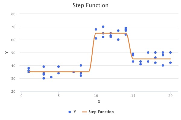
The step function is also known as a piecewise constant regression model.
Basis Functions
Polynomial and piecewise constant models are special cases of a basis function approach. The basis function approach utilizes a family of functions or transformations that can be applied to a predictor. The model takes on the following form:

The basis functions (b) are fixed and known prior to running the model. In polynomial and piecewise constant regression, the basis functions are as follows:

In the next few sections, we’ll discuss splines, which are very commonly used in the basis function approach.
Regression Splines
Regression splines extend upon polynomial regression and piecewise-constant regression.
Piecewise Polynomial Regression
In polynomial regression, an entire polynomial function is fit over the entire range of X values. Piecewise polynomial regression simply involves fitting separate polynomial functions over different ranges of X. The points at which the functions change are called knots. Using more knots leads to a more flexible model. For example, a piecewise polynomial regression model with one knot takes on the following form:

An example of a piecewise polynomial regression model with one knot at X = 12 can be seen in the following graph:
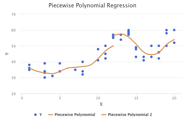
As can be seen from the chart above, piecewise polynomial models are discontinuous. While discontinuity can sometimes be desired, we usually want a continuous model. To solve this, we can introduce constraints, which result in continuous and smooth models.
Constraints and Splines
In order to produce a piecewise polynomial model that is continuous, we need to introduce a continuity constraint. In other words, the separate polynomial models must meet at the knots. Introducing the continuity constraint on the previous chart might result in something like the following:
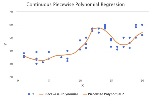
However, the point at which the functions join looks a bit unnatural. This can be addressed by introducing another constraint that results in a smooth join. Specifically, this constraint requires that the derivatives up to degree (d-1) be continuous at each knot. For example, if we have a cubic polynomial (d=3), then the first and second derivatives must be continuous at the knots. A model that is continuous and smooth is known as a spline. Introducing the smoothness constraint on the previous chart might result in the following spline:
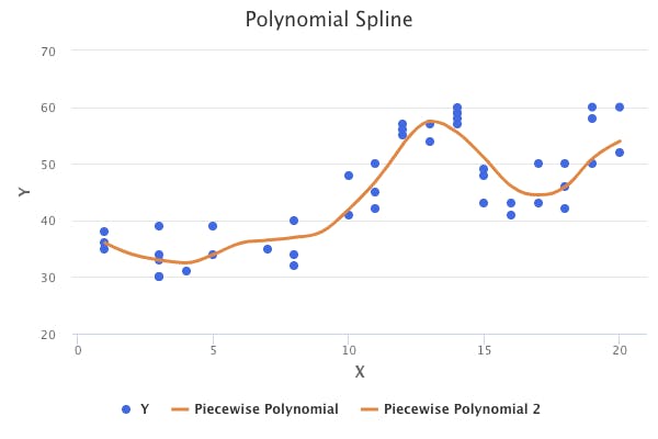
Splines have the potential to have high variance at the outer range of the predictor values, which causes wide confidence intervals at the outer boundaries. This can be addressed through a boundary constraint, which requires the spline function to be linear at the boundaries (before the first knot, and after the last knot). A spline with this additional constraint is called a natural spline.
Choosing the Number and Locations of Knots
There are many methods that can be used to choose the number of knots to use, and their locations.
One option is to place more knots in the regions where we feel that the function might vary the most, and to place fewer knots where it will be more stable.
The first option could work well, but it is more common to simply place knots at uniform percentiles of the data. For example, if we choose to use three knots, then they would be placed at the 25th, 50th, and 75th percentiles of the data. But how do we know how many knots should be used? One option is to simply try out a different number of knots and analyze the fitted curves. Another more objective option is to use cross-validation to choose the number of knots that results in the lowest test error.
Another option is to use cross-validation to determine the number of knots and their locations.
Polynomial Regression vs Regression Splines
Regression splines often produce better results than polynomial regression models. This is because polynomial regression requires the use of a high-degree model to produce a very flexible fit. High-degree models usually lead to highly inaccurate predictions at certain X values. Splines produce flexible fits by introducing knots and separate low-degree functions, which ultimately results in better and stable predictions.
Smoothing Splines
Smoothing splines are an alternative approach to fitting a smooth curve over a dataset. Smoothing splines find a function g(X) that minimizes the following:

The above equation should look familiar to the equation that ridge regression and lasso regression aim to minimize. The first part is simply the residual sum of squares. The second part is a penalty term that encourages g(X) to be smooth. g^m(t) is the m-th derivative of the function, which is a measure of the roughness of the function at some point. The variable m is known as the penalty order, and takes on a value of m=1 for a linear smoothing spline, m=2 for a cubic smoothing spline, m=3 for a quintic (fifth-order) smoothing spline, and m=4 for a septic (seventh-order) smoothing spline. If the function is very wiggly at some point, then the m-th derivative will be large. Therefore, the integral is a measure of the total roughness of the entire function. λ is a tuning parameter that ultimately controls the bias-variance trade-off of the smoothing spline. Larger values of λ will result in an even smoother spline.
Smoothing splines have some special properties:
- Smoothing splines are piecewise cubic polynomials with knots at each of the unique X values in the dataset.
- Smoothing splines are linear at the boundaries (before the first knot, and after the last knot)
The combination of the above two properties means that smoothing splines are natural splines. However, it isn’t the same as the natural spline you would get from a piecewise polynomial function with knots at each unique X value and constraints. Instead, it is a shrunken version of that natural cubic spline because of the presence of the penalty term.
So, how is the λ parameter chosen? As it turns out, the most efficient method is through leave-one-out cross-validation (LOOCV). In fact, LOOCV essentially has the same computational cost as a single fit of a smoothing spline.
Local Regression
Local regression is yet another approach to fitting flexible non-linear functions. It involves determining a fit at some target point X₀ using only the nearby training observations. The process of fitting a local regression model is as follows:
- Gather the fraction (s = k/n) of training points whose xᵢ values are closest to the target point X₀
- Assign a weight Kᵢ₀ = K(Xᵢ, X₀) to each point in this neighborhood, so that the point furthest from X₀ has a weight of zero, and the closest has the highest weight. All but these K nearest neighbors get a weight of zero.
- Fit a weighted least squares regression of the Yᵢ on the Xᵢ using the Kᵢ₀ weights by finding β₀ and β₁ that minimize the following:

There are many important choices to be made when performing local regression, such as how to define the weighting function K, and whether to fit a linear, quadratic, or other type of regression model. However, the most important choice is the choice of the span (s) in step one. The span controls the flexibility of the non-linear fit. The smaller the value of the span, the more local and wiggly it will be. As in most cases, cross-validation is a very useful method for determining the value of the span.
Local regression can be generalized in many different ways. For example, in a setting where we have multiple predictors, one useful generalization involves fitting a multiple linear regression model that is global in some variables, but local in another. This is known as a varying coefficient model. Additionally, local regression generalizes naturally when we want to fit models that are local in multiple predictors instead of just one. However, local regression can perform poorly if we’re trying to fit models that are local in more than 3 or 4 predictors because there will generally be very few training observations close to the target point X₀. K-Nearest Neighbors regression suffers from this same problem.
Generalized Additive Models
What if we wanted to flexibly predict Y on the basis of several different X predictors? Generalized additive models (GAMs) allow for non-linear functions of each predictor, while maintaining additivity. Additivity simply refers to the ability to add together each predictor’s contribution. GAMs can be used in either the regression or classification setting.
Recall that a multiple linear regression takes on the following form:

To allow for non-linear relationships between each predictor and the response, we can replace each βⱼXⱼlinear component with a non-linear function fⱼ(Xⱼ). This results in a GAM model, which looks as follows:

So far, we’ve discussed different methods for fitting functions to a single predictor, such as step functions, basis functions, and splines. The beauty of GAMs is that these methods can be used as building blocks for fitting an additive model. For example, assume that we wanted to predict salary and had year, age, and education as predictors. The GAM would look as follows:

We could fit natural splines for the year and age predictors, and a step function for the education predictor. The plots of the relationship between each of these predictors and the response may look like the following:

Fitting a GAM with smoothing splines is not simple because least squares cannot be used. However, there is an approach known as backfitting, which can be used to fit GAMs with smoothing splines. Backfitting fits a model involving multiple predictors by repeatedly updating the fit for each predictor in turn, holding the others fixed.
Pros and Cons of GAMs
The advantages of GAMs are the following:
- GAMs allow us to fit non-linear functions for each predictor. This allows us to easily model non-linear relationships without having to manually try different transformations on each predictor.
- The non-linear fits can potentially result in more accurate predictions.
- Because GAMs are additive, we can still examine the effect of each predictor on the response, while holding all of the other predictors fixed. This means that GAMs maintain interpretability.
- The smoothness of a function for a predictor can be summarized via degrees of freedom.
The main disadvantage of GAMs is that:
- GAMs are restricted to be additive. This means that variable interactions could be missed. However, interaction terms can be included by adding interaction predictors or interaction functions.
Originally published at https://www.bijenpatel.com on August 7, 2020.
I will be releasing the equivalent Python code for these examples soon. Subscribe to get notified!
ISLR Chapter 7 — R Code
Polynomial Regression and Step Functions
library(MASS)
library(ISLR)
library(ggplot2)

# Working with the Wage dataset
head(Wage)

# Fit a fourth-degree polynomial model to predict wage with age
# Note that this fits an orthagonal polynomial
fit = lm(wage~poly(age, 4), data=Wage)
coef(summary(fit))

# To fit a regular polynomial, we can use the raw=TRUE argument
# This doesn't affect the model in a meaningful way
fit2 = lm(wage~poly(age, 4, raw=TRUE), data=Wage)

# Create a grid of values for age, which we use to make predictions with
agelims = range(Wage$age)
age.grid = seq(from=agelims[1], to=agelims[2])

# Get predictions and standard error bands
preds = predict(fit, newdata=list(age=age.grid), se=TRUE)
preds = data.frame(preds)
preds$age = age.grid
se.bands=cbind(preds$fit+2*preds$se.fit, preds$fit-2*preds$se.fit)
se.bands = data.frame(se.bands)
se.bands$age = age.grid

# Plot the data, the model fit, and the standard error bands with ggplot
ggplot(data=Wage, aes(x=Wage$age, y=Wage$wage)) +
  geom_point() +
  labs(title="Degree-4 Polynomial", x="Age", y="Wage") +
  geom_line(data=preds, aes(x=preds$age, y=preds$fit), colour="blue", size=1.5) +
  geom_line(data=se.bands, aes(x=se.bands$age, y=se.bands$X1), colour="orange", size=0.75) +
  geom_line(data=se.bands, aes(x=se.bands$age, y=se.bands$X2), colour="orange", size=0.75)

# Perform ANOVA to compare models with different degrees
# The more complex model is compared to the simpler model
fit.1 = lm(wage~age, data=Wage)
fit.2 = lm(wage~poly(age, 2), data=Wage)
fit.3 = lm(wage~poly(age, 3), data=Wage)
fit.4 = lm(wage~poly(age, 4), data=Wage)
fit.5 = lm(wage~poly(age, 5), data=Wage)
anova(fit.1, fit.2, fit.3, fit.4, fit.5)
# Quadratic model is better than linear model (p-value: 0)
# Cubic model is better than quadratic model (p-vlaue: 0)
# Quartic model is better than cubic model (p-value: 0.05)
# Quintic polynomial is NOT better than quartic model (p-value: 0.37)

# Note that we also could have used cross-validation to choose a model

# Fit a polynomial logistic regression model to predict if someone makes more than $100,000
logistic.fit = glm(I(wage>100)~poly(age, 4), data=Wage, family=binomial)

# Make predictions for all of the ages
logistic.preds = predict(logistic.fit, newdata=list(age=age.grid), se=T, type="response")
logistic.preds = data.frame(logistic.preds)
logistic.preds$age = age.grid

# Fit a simple step function using the cut function
# Cut automatically chooses cutpoints, but cutpoints can be set manually too
step.fit = lm(wage~cut(age, 4), data=Wage)
coef(summary(step.fit))</span>
Splines
library(splines)

# We continue working with the Wage dataset

# Use the basis function bs() to fit a piecewise polynomial spline
# We use pre-specified knots at ages 25, 40, 65
# By default, a cubic spline is produced
fit = lm(wage~bs(age, knots=c(25, 40, 65)), data=Wage)

# Get predictions
preds = predict(fit, newdata=list(age=age.grid), se=T)
preds = data.frame(preds)
preds$age = age.grid

# Get standard error bands
se.bands=cbind(preds$fit+2*preds$se.fit, preds$fit-2*preds$se.fit)
se.bands = data.frame(se.bands)
se.bands$age = age.grid

# Plot the data, the model fit, and the standard error bands with ggplot
ggplot(data=Wage, aes(x=Wage$age, y=Wage$wage)) +
  geom_point() +
  labs(title="Piecewise Polynomial Spline", x="Age", y="Wage") +
  geom_line(data=preds, aes(x=preds$age, y=preds$fit), colour="blue", size=1.5) +
  geom_line(data=se.bands, aes(x=se.bands$age, y=se.bands$X1), colour="orange", size=0.75) +
  geom_line(data=se.bands, aes(x=se.bands$age, y=se.bands$X2), colour="orange", size=0.75)

# We could also use the df option in the bs() function to use knots at uniform quantiles
# This will set the knots at the 25th, 50th, and 75th percentiles of the age data
fit = lm(wage~bs(age, df=6), data=Wage)

# We could fit a natural spline instead of using basis functions
fit = lm(wage~ns(age, df=4), data=Wage)
preds = predict(fit, newdata=list(age=age.grid), se=T)
preds = data.frame(preds)
preds$age = age.grid
ggplot(data=Wage, aes(x=Wage$age, y=Wage$wage)) +
  geom_point() +
  labs(title="Piecewise Polynomial Spline", x="Age", y="Wage") +
  geom_line(data=preds, aes(x=preds$age, y=preds$fit), colour="blue", size=1.5)

# We can also use a smoothing spline
fit = smooth.spline(Wage$age, Wage$wage, df=6)

# Lastly, we can use local regression
# We will use a span value of 0.5
fit = loess(wage~age, span=0.5, data=Wage)</span>
GAMs
library(gam)

# We continue working with the Wage dataset

# Fit a GAM
# Use a smoothing spline for the year and age variables
# Year spline with 4 df, and age with 5 df
gam.m3 = gam(wage~s(year,4) + s(age, 5) + education, data=Wage)

# Fit a GAM model without the year variable
gam.m1 = gam(wage~s(age, 5) + education, data=Wage)

# Fit a GAM model with a linear year variable instead of a spline
gam.m2 = gam(wage~year + s(age, 5) + education, data=Wage)

# Perform ANOVA tests to compare the different GAM models
anova(gam.m1, gam.m2, gam.m3, test="F")
# The second GAM model is better than the first
# The third GAM model is not better than the second

# Make prediction with the GAM model
preds = predict(gam.m2, newdata=Wage)

# We can also use local regression in GAMs
# Use local regression for the age variable, with a span of 0.7
gam.lo = gam(wage~s(year, df=4) + lo(age, span=0.7) + education, data=Wage)

# We could also use local regression to create an interaction term for the GAM
gam.lo.i = gam(wage~lo(year, age, span=0.5) + education, data=Wage)

# Lastly, we can also perform logistic regression with GAM
gam.lr = gam(I(wage>100)~year + s(age, df=5) + education, family=binomial, data=Wage)</span>
